It is really nice to have a graphical UI to develop new applications in. It makes it a lot easier to understand what is going on and improve the process.
The biggest challenge is it is impossible to see what was changed between the two versions. It can be impossible to track visually. Or it requires a lot of time to run the comparisons.
SAP CPI is creating a BPMN model that is a standard format to show business processes and flows. We already used BPMN in the SAP PO BPM tool.
In the Figaf Tool, we have versioning of all objects. We started by just showing the BPMN model and diffs between it. Unforntalty it is pretty difficult to see what a difference is because there is a lot of metadata that does not make sense.
We wanted to simplify the process, so we created an XML transformation to only show the most important part. This made it easier to see what technical was changed. There was still a long way to understand what is different between the two versions.
This version could also show differences in artifacts so you could see which Groovy scripts was changed.
It still required a lot of effort to understand.
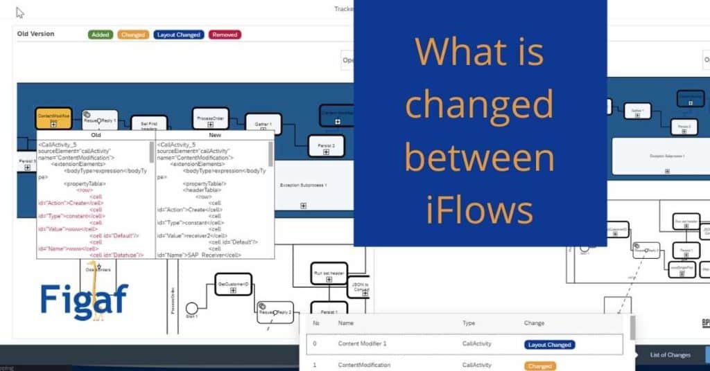
Diff tool
On a presentation call of the Figaf Tool to a potential client, they said they had looked at BPMN.Io. There was a good platform to see what was different between the two iflow versions. It was pretty easy to try out and upload the iflow BPMN model and see the differences between two objects.
The challenge was that it could only show highlight which nodes were different and it would not show what changed in a specific node.
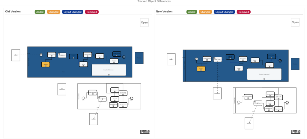
We made a solution to make it easier to see the differences and then you could click on a box and see what part of the code was changed between the two versions.
You can navigate thru the visual model and see all that has changed between the two versions. It really simplifies the delivery process. In the model is the blue boxes where some layout has been changed. It is possible to see that the content modifiers have been moved a little around. It is possible to zoom in and out of the model with the Open minimap box.
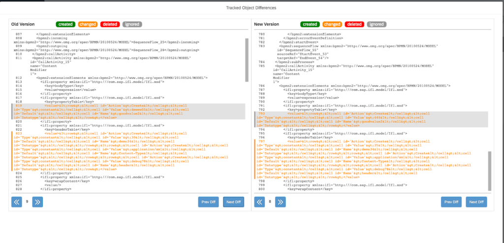
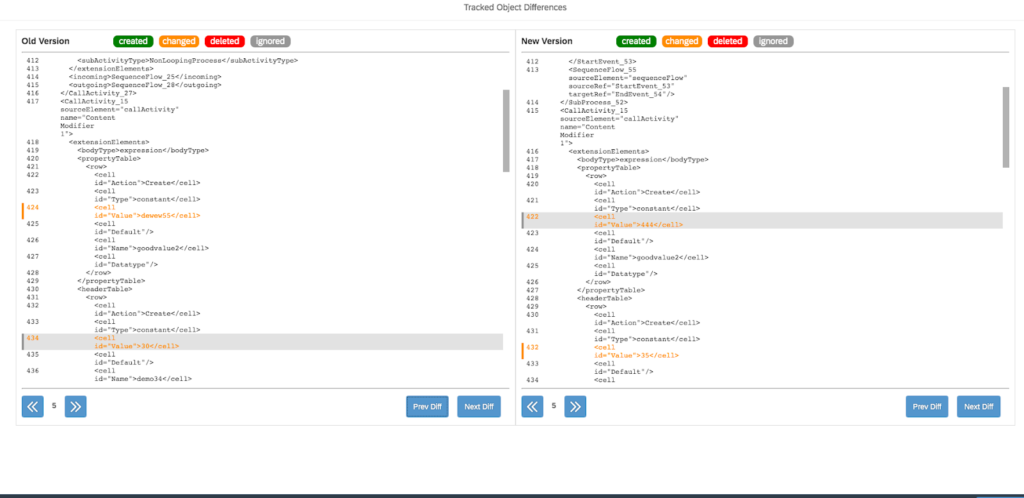
You can also easy see what is changed on a specific node. This makes it a lot faster to get an idea about where to test and if the change is a valid.
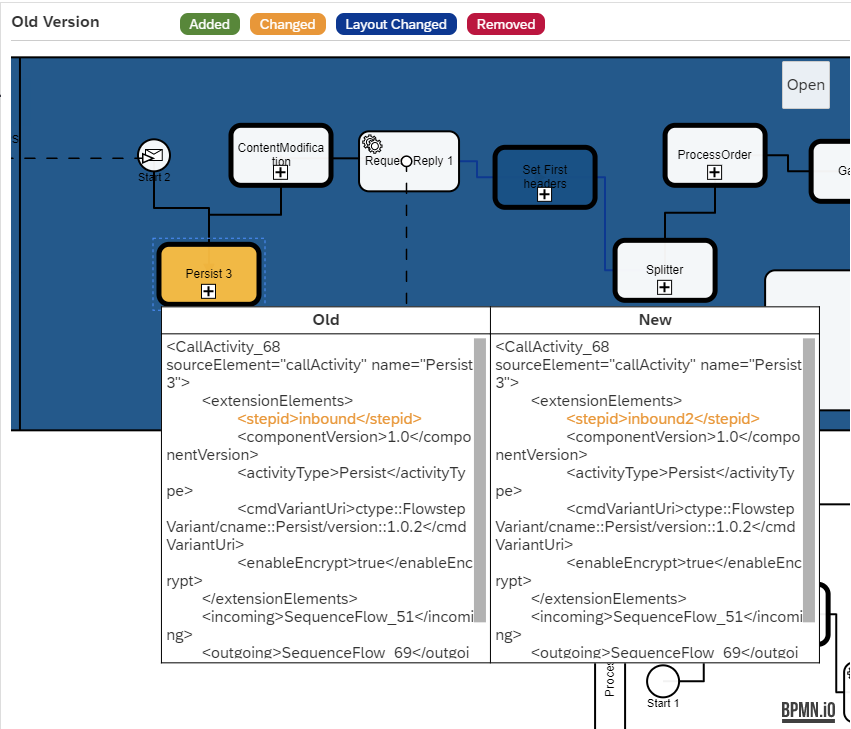
You will need to understand the XML and correlate it to the location in the model. It should be pretty self explantatory.
We have seen that sometimes the full name of the element changes, in the above CallActicity_68. Then the full content will be seen as differences. We hope to find a solution for it.
Try the tool your self
This is a part of the Figaf DevOps Tool, that allows you to manage your SAP CPI integrations much easier. There is a lot more than this visual comparison.
It takes 30-60 minutes to get started and try out the tool. You can run it on your laptop.